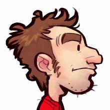
anyway - here are some exercises from work. first one, we were given a photo of a (somewhat) mad scientist and were supposed to just go wherever the photo took us. second one was to create some heavy duty mech or vehicle from a household appliance OR create a heavy duty household appliance. i call this one, "the j0nny" heh heh..
i've always wondered why it seems like the life of my drawings get sucked out of them as soon i start trying to paint them, and about a little less than a year ago i think i finally figured it out. just felt like blogging it for whatever random reason just now.. here we go:
design bias or design hierarchy. (it's called design "bias" because, we all like and are bias towards different things - and are bias of different things at different times. think of it as having a hierarchy of things you value most in making a particular picture at a particular time.)
like life, you can't do/have EVERYTHING all at once. and who really wants EVERYTHING?.. think about how cluttered and awful your life would be. you've gotta find your purpose/goals, prioritize your desires, and decide which things you like doing (and the things you don't) will get you where you want to be. your bias can change depending on the need. it's fine.
if i don't make a clear decision, all kinds of design principles might sneak in and compete with each other for being the most important thing... and i might not even like which one ends up winning... i might even HATE it.
so in these exercises, i was also balancing what i love doing with other things i like to do, but down-play ones that compete so i don't ruin my picture (in my eyes.) in my case, i like to let my lines do the talking instead of the paint - too much paint (or even color/value for that matter) overpowers the lines and makes them less important..... BUT THAT'S THE MOST IMPORTANT PART FOR ME!! no matter how awesome you're lineweight, or gesture, or sketchy... whatever. as soon as the value/color/rendering of your image starts going up, your lines start to take a back seat. if you're cool with that - DO IT. it's kinda fun thinking about who you want to win in a design principles sanctioned street fight. form vs. shape... line vs. color.. value vs. story?? and color could really go up against form or shape or anybody else. you've just gotta decide which one you're bias towards so you can help throw the match, rig the fight, and be happy with who wins. think about how dumb cheering equally for two teams playing against each other is.
i almost just typed that CONTRAST was the same thing, but now that i think about it.. BIAS helps me think about what i want happening, and what i like vs. what i'm down playing.. so for now, in my mind... contrast is really just how two fighters relate being placed next to each other, and bias is deciding how the fight goes between them rather than just letting it happen.
[/thinking]
hope your holidays were as awesome as mine! what's up 2012? how you been?? you can totally hang out with me. i think we're gonna be pretty awesome friends. i've got skyward sword at my house whenever you wanna come by and play. promise.